移动WEB开发之rem布局--苏宁首页案例制作(技术方案1)
创始人
2024-03-21 21:02:27
0次
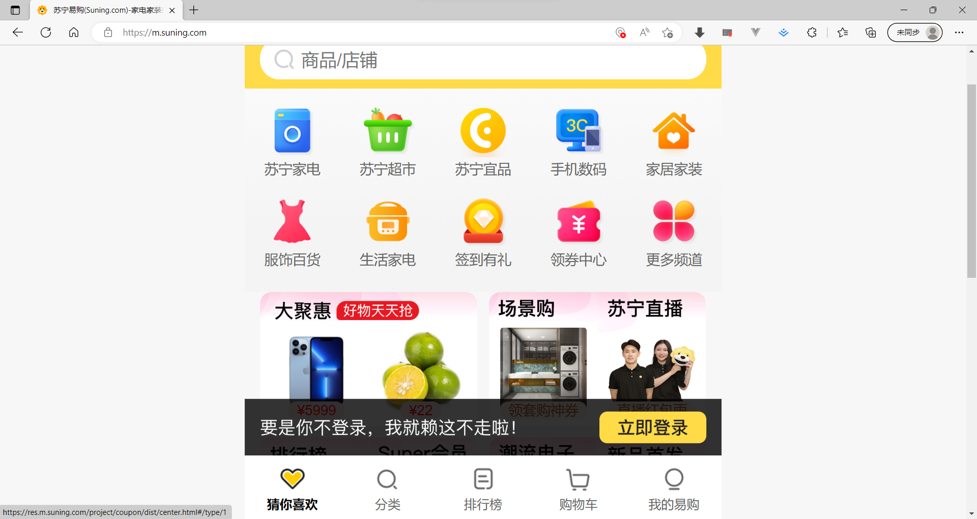
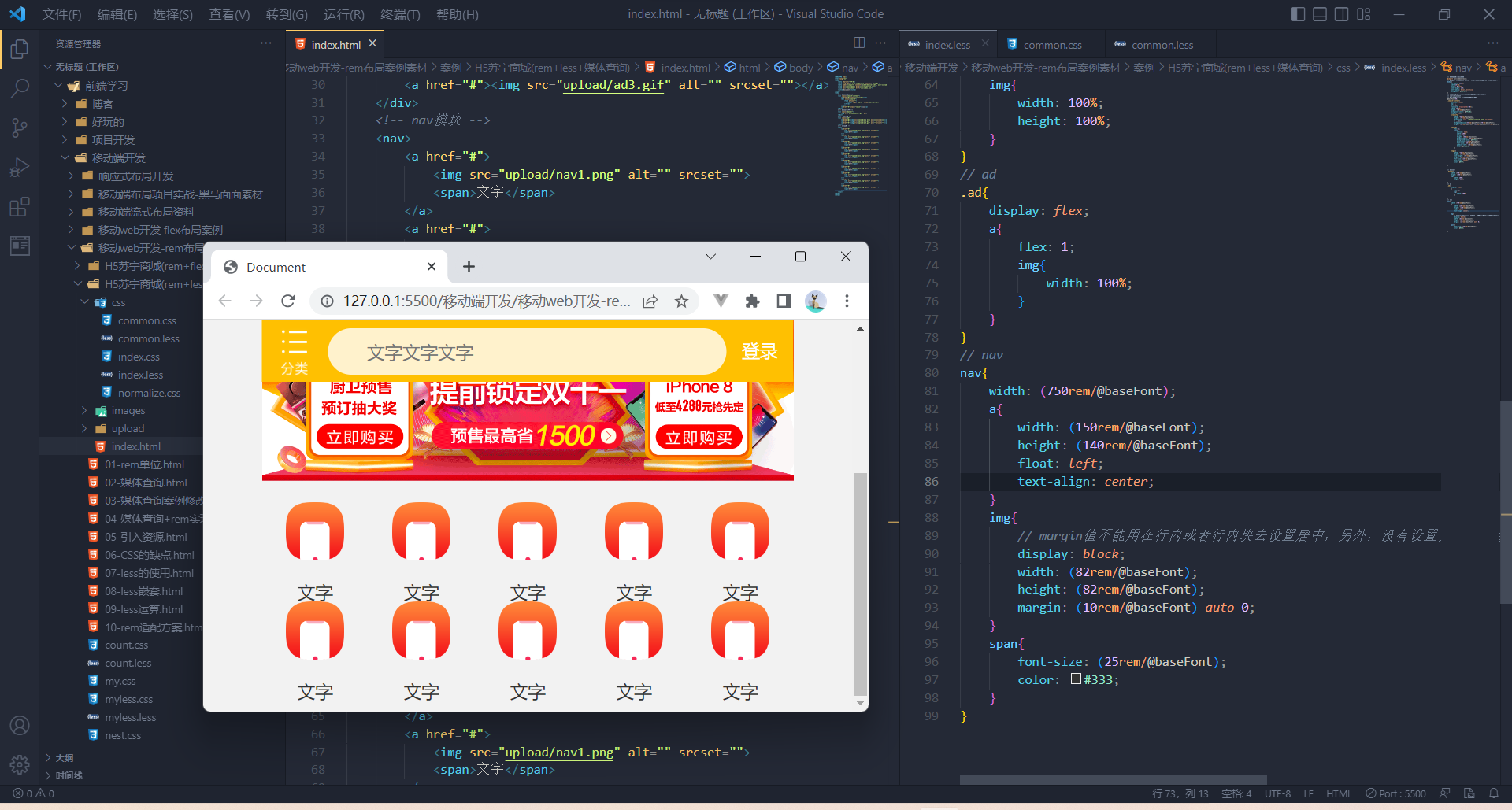
案例:苏宁网移动端首页
访问地址:苏宁易购(Suning.com)-家电家装成套购,专注服务省心购!
1. 技术选型
方案:我们采取单独制作移动页面方案
技术:布局采取rem适配布局(less + rem + 媒体查询)
设计图: 本设计图采用 750px 设计尺寸
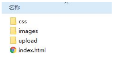
2. 搭建相关文件夹结构
3. 设置视口标签以及引入初始化样式
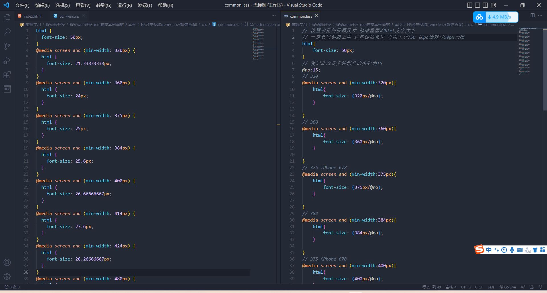
4. 设置公共common.less文件
1. 新建common.less 设置好最常见的屏幕尺寸,利用媒体查询设置不同的html字体大小,因为除了首页其他页面也需要
2. 我们关心的尺寸有 320px、360px、375px、384px、400px、414px、424px、480px、540px、720px、750px
3. 划分的份数我们定为 15等份
4. 因为我们pc端也可以打开我们苏宁移动端首页,我们默认html字体大小为 50px,注意这句话写到最上面
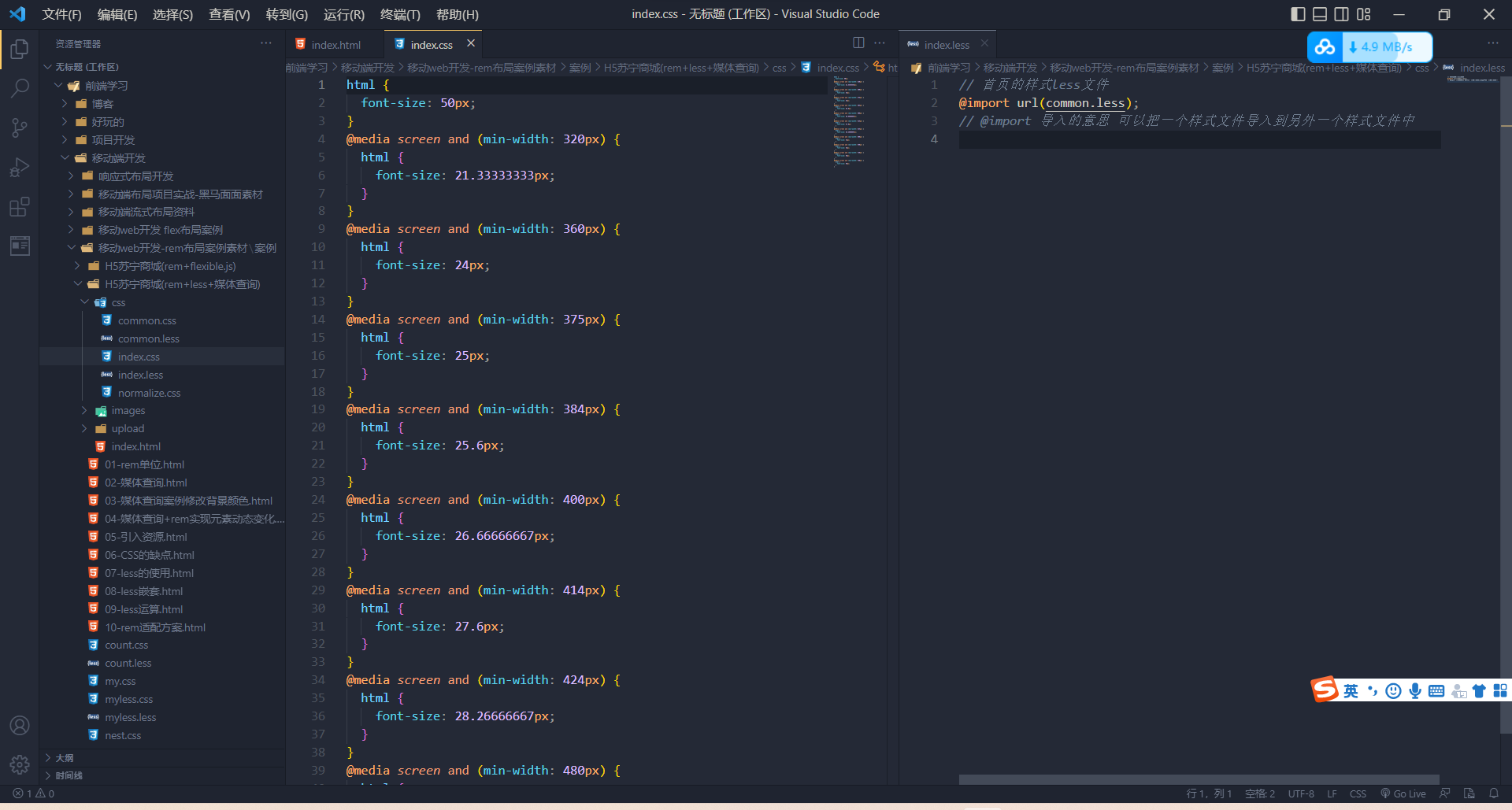
5. 新建index.less文件
1. 新建index.less 这里面写首页的样式
2. 将刚才设置好的 common.less 引入到index.less里面 语法如下:
// 在 index.less 中导入 common.less 文件
@import “common”
3. 生成index.css 引入到 index.html 里
6. body样式
body {
min-width: 320px;
width:15rem;
margin: 0 auto;
line-height: 1.5;
font-family: Arial,Helvetica;
background: #F2F2F2;
}
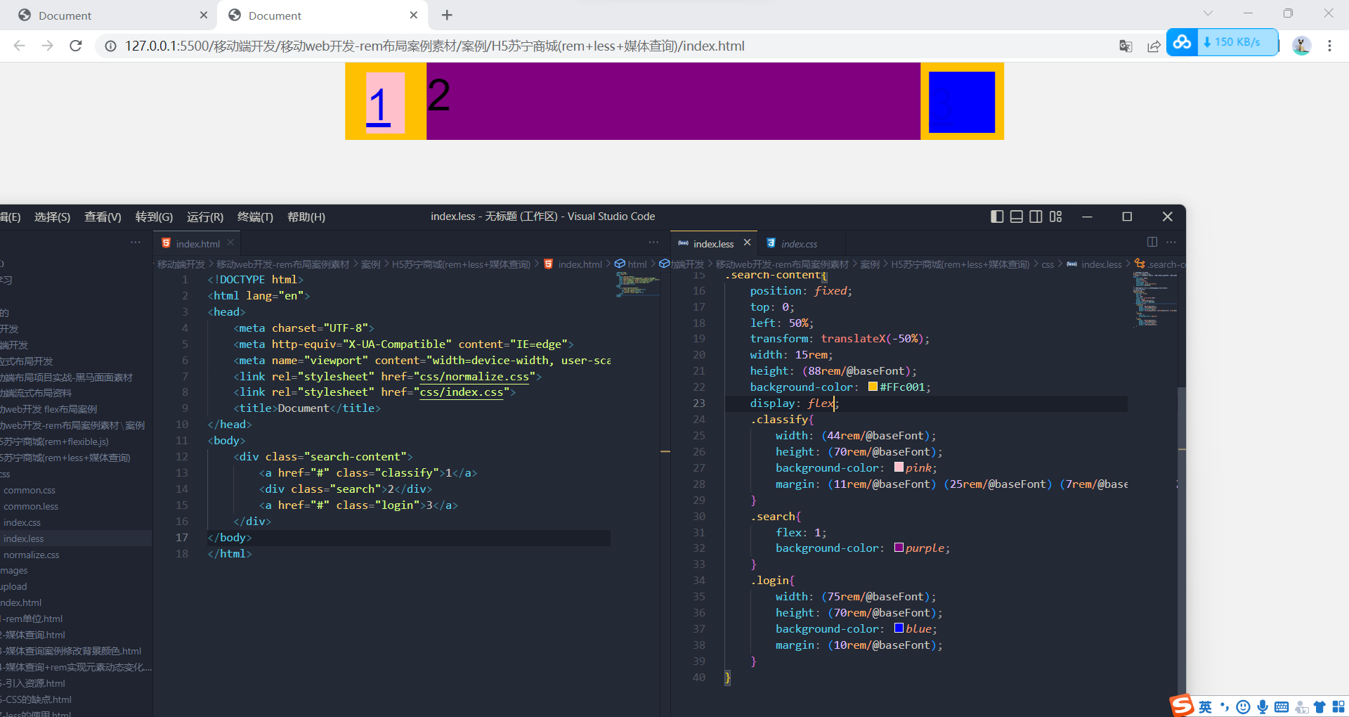
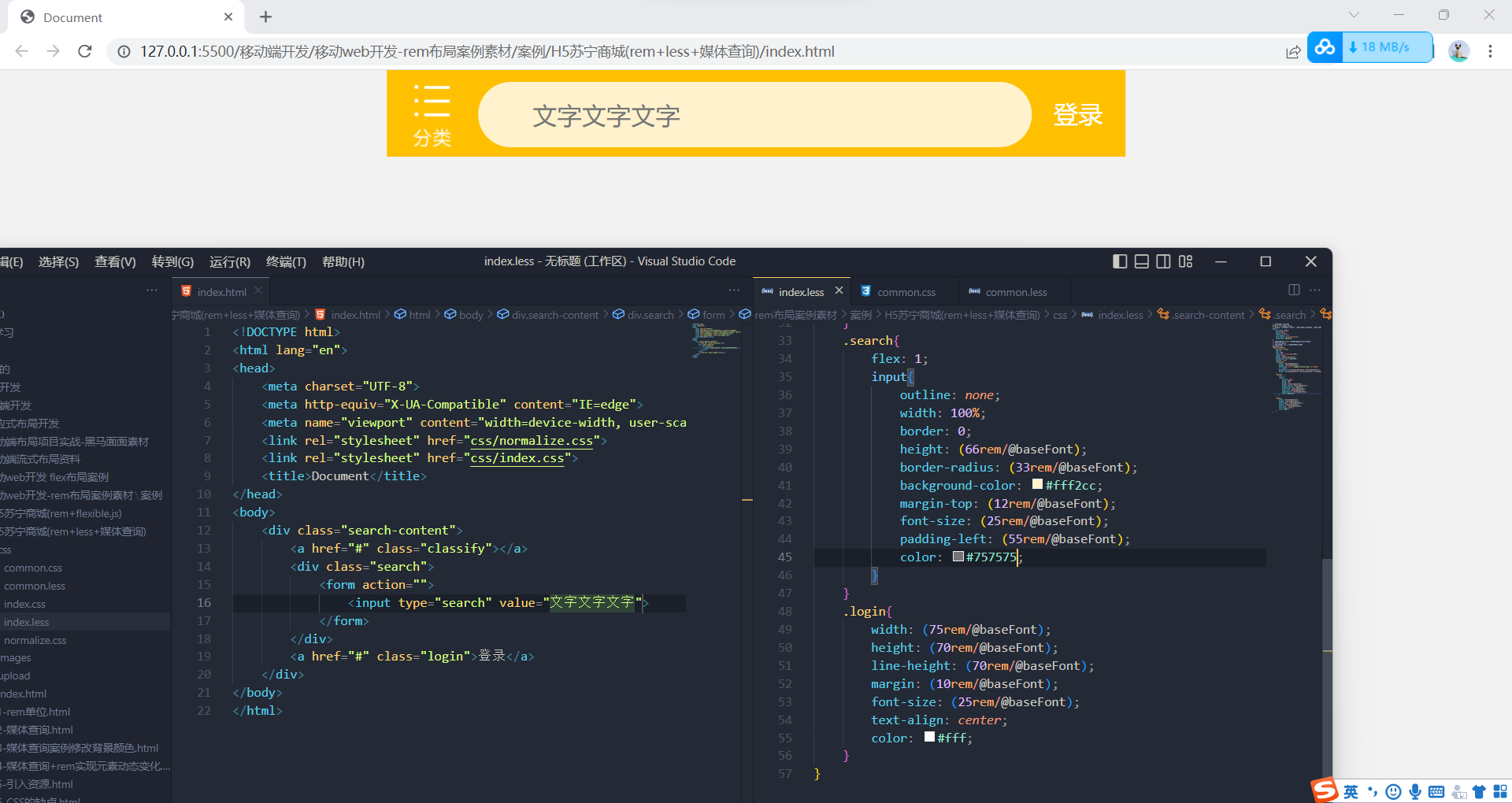
search-content模块制作
search模块制作
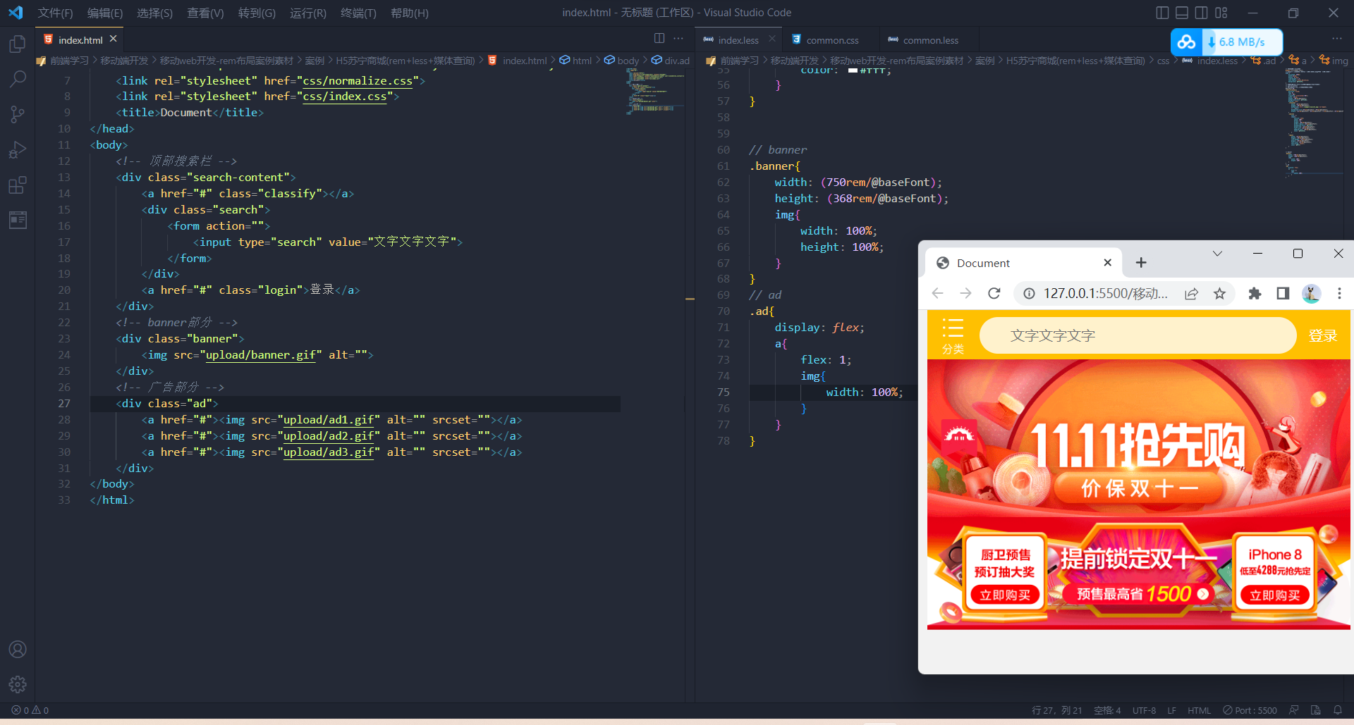
banner和广告模块制作
 nav部分制作
苏宁的做法是,把它固定死,宽度750px分5份
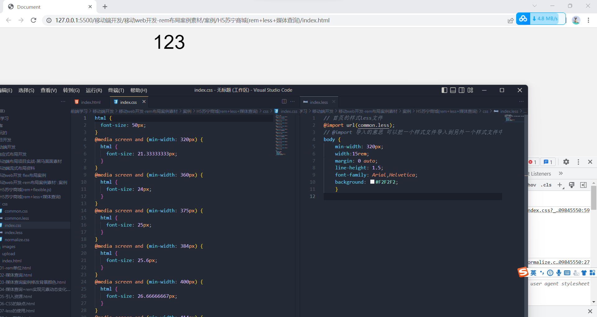
// 首页的样式less文件
@import url(common.less);
// @import 导入的意思 可以把一个样式文件导入到另外一个样式文件中
body {min-width: 320px;width:15rem;margin: 0 auto;line-height: 1.5;font-family: Arial,Helvetica;background: #F2F2F2;
}
// 页面元素rem计算公式:页面元素的px/html字体大小
// search-content
// 这里的50,是我们在750的页面下设置的
@baseFont:50;
.search-content{position: fixed;top: 0;left: 50%;transform: translateX(-50%);width: 15rem;height: (88rem/@baseFont);background-color: #FFc001;display: flex;.classify{width: (44rem/@baseFont);height: (70rem/@baseFont);background: url(../images/classify.png) no-repeat;// 背景缩放background-size:(44rem/@baseFont) (70rem/@baseFont);margin: (11rem/@baseFont) (25rem/@baseFont) (7rem/@baseFont) (24rem/@baseFont);}.search{flex: 1;input{outline: none;width: 100%;border: 0;height: (66rem/@baseFont);border-radius: (33rem/@baseFont);background-color: #fff2cc;margin-top: (12rem/@baseFont);font-size: (25rem/@baseFont);padding-left: (55rem/@baseFont);color: #757575;}}.login{width: (75rem/@baseFont);height: (70rem/@baseFont);line-height: (70rem/@baseFont);margin: (10rem/@baseFont);font-size: (25rem/@baseFont);text-align: center;color: #fff;}
}   // banner
.banner{width: (750rem/@baseFont);height: (368rem/@baseFont);img{width: 100%;height: 100%;}
}
// ad
.ad{display: flex;a{flex: 1;img{width: 100%;}}
}
// nav
nav{width: (750rem/@baseFont);a{width: (150rem/@baseFont);height: (140rem/@baseFont);float: left;text-align: center;}img{// margin值不能用在行内或者行内块去设置居中,另外,没有设置宽度的块级元素也不可以设置display: block;width: (82rem/@baseFont);height: (82rem/@baseFont);margin: (10rem/@baseFont) auto 0;}span{font-size: (25rem/@baseFont);color: #333;}
}
Document
![]()
![]()
![]()
![]()
相关内容
热门资讯
汽车油箱结构是什么(汽车油箱结...
本篇文章极速百科给大家谈谈汽车油箱结构是什么,以及汽车油箱结构原理图解对应的知识点,希望对各位有所帮...
美国2年期国债收益率上涨15个...
原标题:美国2年期国债收益率上涨15个基点 美国2年期国债收益率上涨15个基...
嵌入式 ADC使用手册完整版 ...
嵌入式 ADC使用手册完整版 (188977万字)💜&#...
重大消息战皇大厅开挂是真的吗...
您好:战皇大厅这款游戏可以开挂,确实是有挂的,需要了解加客服微信【8435338】很多玩家在这款游戏...
盘点十款牵手跑胡子为什么一直...
您好:牵手跑胡子这款游戏可以开挂,确实是有挂的,需要了解加客服微信【8435338】很多玩家在这款游...
senator香烟多少一盒(s...
今天给各位分享senator香烟多少一盒的知识,其中也会对sevebstars香烟进行解释,如果能碰...
终于懂了新荣耀斗牛真的有挂吗...
您好:新荣耀斗牛这款游戏可以开挂,确实是有挂的,需要了解加客服微信8435338】很多玩家在这款游戏...
盘点十款明星麻将到底有没有挂...
您好:明星麻将这款游戏可以开挂,确实是有挂的,需要了解加客服微信【5848499】很多玩家在这款游戏...
总结文章“新道游棋牌有透视挂吗...
您好:新道游棋牌这款游戏可以开挂,确实是有挂的,需要了解加客服微信【7682267】很多玩家在这款游...
终于懂了手机麻将到底有没有挂...
您好:手机麻将这款游戏可以开挂,确实是有挂的,需要了解加客服微信【8435338】很多玩家在这款游戏...