QML + KDDockWidget 实现 tabwidget效果( 窗口可独立浮动和缩放)
前言
前面文章介绍过在QML中使用ListView实现TabBar标签拖拽交换位置效果(文章在这里)
先在此基础上升级一下,结合KDDockWidget做一个可浮动的窗口效果。
关于KDDockWidget的介绍,以前的文章有写过,可参考:
qml dockwidget窗口停靠
KDDockWidgets源码编译及安装
KDDockWidget是第三方开源项目,可以用于实现QML中Dock窗口效果,Qt本身不支持QML的Dock效果,所以正好弥补这部分空缺。而KDDockWidget中其实是支持Tab合并效果,但是在实际使用过程中遇到很多问题,该功能并不是很完善,所以索性自己使用QML来实现tabbar效果,然后结合KDDockWidget,可将每个tab页面进行单独的浮动和缩放。
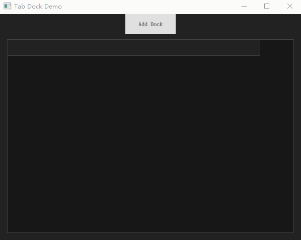
先看效果:
本文Demo下载
点击下载
KDDockWidget动态库编译环境 VS2019
Demo使用环境 Qt5.15.2+VS2019
正文
关于ListView实现一个tabbar移动效果,前面文章有介绍过,这里简单贴个代码:
ListView{id:tabBaranchors.left: parent.leftanchors.right: parent.rightanchors.rightMargin: 66interactive: falseanchors.leftMargin: 20z:15height: 30spacing: 1orientation:ListView.HorizontalcurrentIndex: -1;move: Transition {NumberAnimation { property: "x"; duration: 150 }}moveDisplaced: Transition {NumberAnimation { property: "x"; duration: 150 }}model:ListModel{id:tabModelonCountChanged: {if(count > 0)tabBar.currentIndex = count-1}}delegate: TabButton{id:tabButtonheight: 30width: 120contentItem: Text {font.pixelSize: 14font.family: "Source Han Sans SC"text: docknamehorizontalAlignment: Text.AlignHCenterverticalAlignment: Text.AlignVCentercolor: tabBar.currentIndex === index ? "#3692F0" :"#525252"elide: Text.ElideMiddle}background:Item{Rectangle {color: tabBar.currentIndex === index ? "#171717" : "transparent"border.width: tabBar.currentIndex === index ? 1 : 0border.color: "#404040"height: parent.height+3width: parent.widthx:-1;y:-2Rectangle{y:parent.height-1width: parent.widthheight: 3color: "#171717"visible: tabBar.currentIndex === indexz:20}}}MouseArea{id:ma2anchors.fill: parentpreventStealing: truehoverEnabled: trueonPositionChanged: {var other_index = tabBar.indexAt(ma2.mouseX + tabButton.x, ma2.mouseY + tabButton.y);if (other_index !== -1 && pressed) {if (index !== other_index) {tabModel.move(index, other_index,1);tabBar.positionViewAtIndex(other_index,ListView.Center)}}}onClicked: {tabBar.currentIndex = index}}}}
接下来看每个单独的dock窗口
import QtQuick 2.0
import QtQuick.Controls 2.15
import com.kdab.dockwidgets 1.0 as KDDWKDDW.MainWindowLayout{id:panelproperty string dockName: "dock#1"uniqueName:"MainLayout1"KDDW.DockWidget{id:dock1uniqueName:"dock#1"property bool isFirstFloating: trueproperty bool floating: falseRectangle{color:"#171717"Label{text:"This is Dock #1"anchors.centerIn: parentfont.pixelSize:40color: "white"}}onSigFloatClicked:{dock1.floating = !dock1.floatingif(!dock1.isFloating){removeTimer.name = panel.dockNameremoveTimer.start()}else{addData(panel.dockName)}}//关闭按钮已在DockTitleBar中隐藏
//        onSigCloseClicked:{
//            removeData(panel.dockName)
//        }}Component.onCompleted: {addDockWidget(dock1,KDDW.KDDockWidgets.Location_OnLeft)}
}
由于我们是自定义的tabbar效果,所以这里没有用KDDockWidget提供的addDockWidgetAsTab接口,而是直接使用addDockWidget,每个tab page是一个单独的MainWindowLayout,包含一个独立的DockWidget。浮动窗口功能是直接点击floating button来调用相应接口实现。
代码中用到的KDDockWidget是在源码基础上进行部分修改后重新编译成的动态库,可根据实际项目需求,对源码进行适当修改,若需要修改后的源码,可联系我提供。
本文只实现了窗口的浮动效果,没有添加窗口关闭,若有需要,可在自动以标题栏中将关闭按钮显示出来,并添加其逻辑即可。
不解之处,可私信。
本文Demo下载
点击下载
KDDockWidget动态库编译环境 VS2019